I have decided to look at book designs, and how they have designed them. I have found a large range of different designs, which can interpret different things.

I think this design is a interesting design. This goes well with what the book is about, fishing. The textured look to the book can relate to the fish scales, and this looks interesting and effective. The spine of this book is very large as the spine is coloured in black, and to separate the words with a small image of a fish.
I like that the back of the book is plain, with just showing the blurb. I think this is a good designs, and looks interesting, and effective.

This next design is very different to the first one, as this looks, and shows a lot more graphic design to the book. The fact that the book is about design, this again has connected the design, and the information of the book very well. I think the back of the book is too busy, and looks very cluttered, although I like the idea of the design.
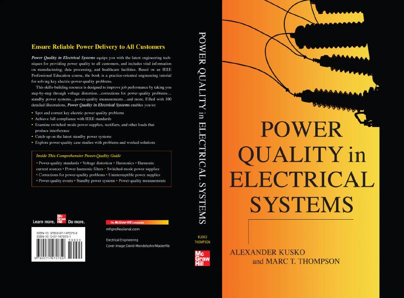
This design is again completely different to the previous design books. This stands out very well, from the other designs. The book is about electricity, so the front of the book has an images of electrical objects. I like that the objects are in a silhouette, which also reflects the rest of the book. I think this is a very nice design, which looks simple and effective to attract people.

This is Alice in Wonderland book, and once you know the story line, you know why this is the front design of the book. Again this has a connection between the design and the book, which seems to be a constant similarity on all books. The design has used a different media on the front instead of the others, I think this also is a connection between the story, and the design of he book.

This is a very different design for this book. This has used photography based media on the front of the book. They have made the whole book black and white to maybe show that this is a old story line.

This design has a very graphic side to it, which is very different to the other pervious designs. I think this shows that no matter what the design type is, it will always look good depending on how you lay it out. I think this looks like a really interesting front cover. I think there is too much information on the back of the book, although `i like the overlay of the font from the graphics behind.

I choose this book design as this again is another very different design to the others. This has many photos on the book, showing maybe characters, where it is set, and the author. I think this is laid-out very strange, and very unique. don't I think the blurb on the back of the book is laid out well, as this has breaks, and does not look flowing.
No comments:
Post a Comment