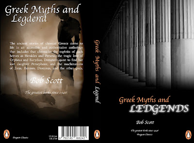
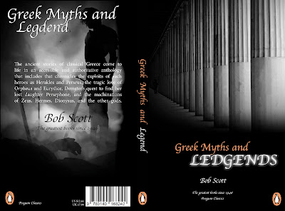
This design was my first, I thought that the black and white would connect with the past. I thought that this was a good technique to use on my book. I edited the images on photoshop to create a the fade in and out of the images from the black background. I thin the back of the book is slightly bare, and needs something to be added to make it look more interesting. I also think that the penguin logo is to large in the left corner of the book.

This was my second design, I changed the images, as they were not Greek. They were Roman. I changed the image and again added affects to them to make them fade with the black background. I preferred this design than the previous, as I think the colour of the image at the back of the book lightens up the design from the black background. I think the information is good, and they are the right size in relation of the book.

This was my third design I created for my book. I edited the image by changing it to black about white so this would flow with the rest of the book. Also this would relate to the history, and the past of the Greek army. I think this looks better than the then pervious design, as this makes the coloured writing to stand out more from the black background.
This is my final design hat I printed off to wrap around my book. I wanted to see what this would look like with a completely different look by changing the black to white. I think this looks more attractive, as the black was a negative colour, and made the book look slightly aggressive. I also edited the images so that they would fade with the white background. I added a line at the bottom running the whole way thought the design of the book, to make this look interesting, and professional. I also removed the authors name at the back, as this looks tacky, and looked like I was trying to fill up space. I replaced it with a small image that was faded.


This comment has been removed by the author.
ReplyDeleteThis comment has been removed by the author.
ReplyDelete