Tuesday 24 January 2012

Breif

You may choose either book (neither are real books)

Book 1:

Greek Myths and Legends

by Bob Scott

Back Cover Blurb:
The ancient stories of classical Greece come to life in an accessible and authoritative anthology that includes that chronicles the exploits of such heroes as Herakles and Perseus, the tragic love of Orpheus and Eurydice, Demeter's quest to find her lost daughter Persephone, and the machinations of Zeus, Hermes, Dionysus, and the other gods.


Product Details

·       Paperback: 160 pages
·       Publisher: Penguin
·       Language: English
·       ISBN-10: 0140168249
·       ISBN-13: 978-0140168242
·       Product Dimensions: measure own mock-up book


Book 2

The Natural History of Britain and Ireland
By Virginia Graham

Back Cover Blurb:
The natural history of Britain and Ireland is both well-loved and fascinating. Each biological grouping is introduced and explained in an engaging and highly informative way, making it the perfect addition to every family bookshelf, as well as an ideal gift for every nature lover.

Packed with stunning, specially commissioned photographs and a wealth of information The Natural History of Great Britain and Ireland updates what is known of the wildlife and landscape of our islands.


Product Details
•           Paperback: 1805 pages
•           Publisher: Penguin
•           Language: English
•           ISBN-10: 0140168367
•           ISBN-13: 978-014098762
•           Product Dimensions: measure own mock-up book

Research - Book Covers [Full]

I have decided to look at book designs, and how they have designed them. I have found a large range of different designs, which can interpret different things. 


I think this design is a interesting design. This goes well with what the book is about, fishing. The textured look to the book can relate to the fish scales, and this looks interesting and effective. The spine of this book is very large as the spine is coloured in black, and to separate the words with a small image of a fish.

I like that the back of the book is plain, with just showing the blurb. I think this is a good designs, and looks interesting, and effective.

This next design is very different to the first one, as this looks, and shows a lot more graphic design to the book. The fact that the book is about design, this again has connected the design, and the information of the book very well. I think the back of the book is too busy, and looks very cluttered, although I like the idea of the design.


This design is again completely different to the previous design books. This stands out very well, from the other designs. The book is about electricity, so the front of the book has an images of electrical objects. I like that the objects are in a silhouette, which also reflects the rest of the book. I think this is a very nice design, which looks simple and effective to attract people.


This is Alice in Wonderland book, and once you know the story line, you know why this is the front design of the book. Again this has a connection between the design and the book, which seems to be a constant similarity on all books. The design has used a different media on the front instead of the others, I think this also is a connection between the story, and the design of he book.


This is a very different design for this book. This has used photography based media on the front of the book. They have made the whole book black and white to maybe show that this is a old story line.


This design has a very graphic side to it, which is very different to the other pervious designs. I think this shows that no matter what the design type is, it will always look good depending on how you lay it out. I think this looks like a really interesting front cover. I think there is too much information on the back of the book, although `i like the overlay of the font from the graphics behind.


I choose this book design as this again is another very different design to the others. This has many photos on the book, showing maybe characters, where it is set, and the author. I think this is laid-out  very strange, and very unique. don't I think the blurb on the back of the book is laid out well, as this has breaks, and does not look flowing.

Research - Book Covers [Front]

I have a couple of books that I wanted to look at, to see how their front covers look like, as this is the main design that people will look at. I also what to look at how they have designed the front cover.

I think this front cover is very unusual, with is very bright, and bold colours used on the front of the book. The strange symbols, and icons on the book in black make the book to become more noticeable from other books. All the icons connect to chicago, for example people, buildings, fire hazard, water and many other icons.

I think this looks like a strange front cover, and not one that I would of thought of, although this is because I don't think that people would like the front cover, and maybe find this unpleasing.


This is a very well known book (or books). They keep the layout, and the design of their books the same, and only change the title, and other information on the book. They make the book look interesting by including angled designs, and text.


This book design has used a very good, and interesting technique. They have added an image in the background of the text showing you what the title means. the layout of the book, also added an interest by adding the 'the' in the 'I'. I also think the red banner on the left side of the book makes it look interesting, and professional.

I think the front design of the book is a bit busy, and I think the designer could of spaced out, the graphics on the book a bit more. It looks like it is a bit squashed, and tight on the front of the book.


This front cover is really interesting and attracts my eye to the book. I like that colours that have been added to the book, I think these colours go very well with each other. A great technique they have included on the front cover of this design, is that the designer changed the colour of the text the same as the background. You can still see very clearly what the text says, and the 'before' between the two 'life' words is a very  cleaver, and attractive technique.


I think this design of this book is a very attractive design, showing what the book is about. I think this looks very eye catching, and I like the silhouette of the birds with the deep red background. I think the red would symbolize the danger of these birds, which makes the book look very interesting, and a very clever. I like the title at an angle which also shows, and symbolizes danger.


I choose this front cover design book, because I wanted to see what it would look like with just a photograph on the front of the book. I think this looks good, as it does not look out of place. Another effect the designer has added, is that he has blackened the edges of the photo, so this focuses on one point. I also think the font type used on the front of the book is also very important, as this type face is very abrupt similar to the photo.

Research - Book Covers [Spines]

Spins of the books are very important, this can make the design of the book continue to flow, with the front and the back of the book. Some stretch the image over both sides of the book by using the spine, and some use it to stop and cut the image, and change the colour to make the title stand out. Nearly all books use the spine to show the title, the authors name, and the publisher's logo. I wanted to get ideas from my research images of the spines, on what I could do to mine own spine.

These books have very different colours, and if you notice some of the books don't have a title, or any information on the side of the spine at all. One book has an image on the side of the spine, you can create many different designs on the spine of books, this all matters on if the spine of the book is wide enough to add a image, or any information at all.


This images shows the different sizes of the spines hat can be created. This also gives you a clue on what you can add no the spine, depending on the size of the book. The widest book, only have a small piece of information, although they have placed it upright instead of sidewards which most books have.


This images shows the different designs you can have on the spine of a book. As you can see if they are a series of books, they usually have the same designs, just different colours, and different information.

Book: Designs

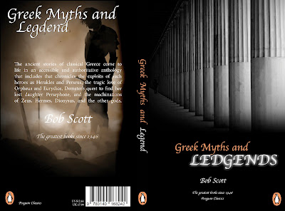
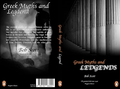
These are my designs that I created for the cover of my book. I designed 4 different versions, and the final cover was the one I choose to print off, and wrap around my book.


This design was my first, I thought that the black and white would connect with the past. I thought that this was a good technique to use on my book. I edited the images on photoshop to create a the fade in and out of the images from the black background. I thin the back of the book is slightly bare, and needs something to be added to make it look more interesting. I also think that the penguin logo is to large in the left corner of the book.


This was my second design, I changed the images, as they were not Greek. They were Roman. I changed the image and again added affects to them to make them fade with the black background. I preferred this design than the previous, as I think the colour of the image at the back of the book lightens up the design from the black background. I think the information is good, and they are the right size in relation of the book.


This was my third design I created for my book. I edited the image by changing it to black about white so this would flow with the rest of the book. Also this would relate to the history, and the past of the Greek army. I think this looks better than the then pervious design, as this makes the coloured writing to stand out more from the black background.

This is my final design hat I printed off to wrap around my book. I wanted to see what this would look like with a completely different look by changing the black to white. I think this looks more attractive, as the black was a negative colour, and made the book look slightly aggressive. I also edited the images so that they would fade with the white background. I added a line at the bottom running the whole way thought the design of the book, to make this look interesting, and professional. I also removed the authors name at the back, as this looks tacky, and looked like I was trying to fill up space. I replaced it with a small image that was faded.